UI Layout
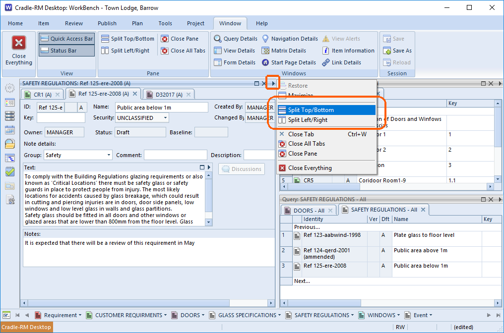
The Cradle WorkBench UI screen is divided into panes, tabs. Tabs can hold a variety of data, items in forms, queries as views, diagrams and so on. When you subsequently create more data (say opening an item from the project sidebar) WorkBench will heuristically attempt to find the most appropriate pane to place the item in. For example if there is a query in one pane and an item in another, opening another item should place it with the other item.
Panes
The main sub division of the screen is a pane. Each pane is a region that can contain one or more tabs.
Tabs
Each pane is a region that can contain one or more tabs. A tab is a container with a selectable name and a rectangular area that contains the results of running a query, report, metric or graph, or a single item that is being edited.
Tabs behind Tabs?
If you’ve run a couple of queries and opened a couple of items they will each be in a separate tab. Arranging the screen panes and tabs is the answer. If you want to see those tabs side by side you can split the screen horizontally or vertically to arrange the screen panes. You can then drag and drop the tabs into these new panes.

There are other UI (User Interface ) commands that allow you to Maximize and Restore the tab from the same menu.
Sessions

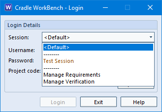
You can design your Cradle UI with a set of panes grouped in nested rows and columns in your preferred layout. This layout is called a session. Using sessions is the easiest way to maximise your productivity with Cradle.

