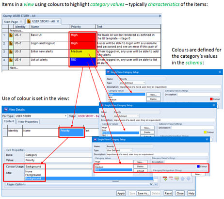
Handling masses amount of data within a project can be very challenging. Especially when only wanting to see certain values. Adding colour to these values is not only simple but very effective.
It is usual for most types of information, particularly user stories, features, needs, requirements, test cases and test results to have attributes that characterise the items, such as:
– The priority or release cycle of a user story
– The result of a test
– The responsibility of a system requirement
– The severity of a risk
It is helpful to colour-code these values and to display the attributes with background or foreground colours set from the attributes’ values. To do this:
1. Define colours for the category code’s values in the schema
2. When the category is shown in a view cell, enable use of colour, either foreground or background
You can choose any colours for your values, but there are obvious advantages in using ‘traffic light’ based colours to convey items that are important, delinquent, serious or failures (typically red) and optional, low, OK, satisfactory or pass (typically green), with orange and yellow used for intermediate values. We typically use a bright blue for unset values, simply because they ‘stand out’.

Hopefully after this you can start to implment colour into projects making it easier for everyone locating key data. The cradle help offers in depth detail on topics relating to values in colour.

