Many of us spend long periods of time working at our computer screens. Consequently, eye strain can become a serious problem. Also, we can sometimes be more productive if we can maximise the amount of information shown. Hence, changing the text size used in the Cradle UI can help in both of these cases, and in several other situations as well.
Maximised Data Display Area
Read articles covering how to maximise the screen area available to display information or drawings.
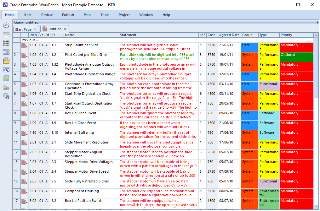
For comparison, if you use all of the tips described in that other blog post, the UI will have a maximised data display area and will appear like this:
Increase Text Size
You can increase the size of text used in the UI by setting the Text size user preference to Large:
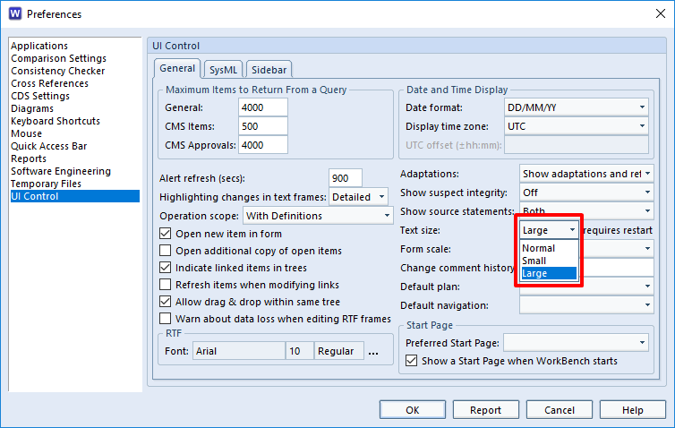
You must re-start WorkBench after making this change.
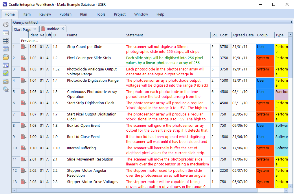
Using the larger text, the above query and view will be shown like this:
Decrease Text Size
You can decrease the size of text used in the UI by setting the Text size user preference to Small:
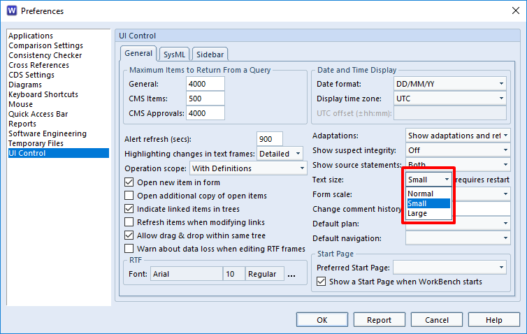
You must re-start WorkBench after making this change.
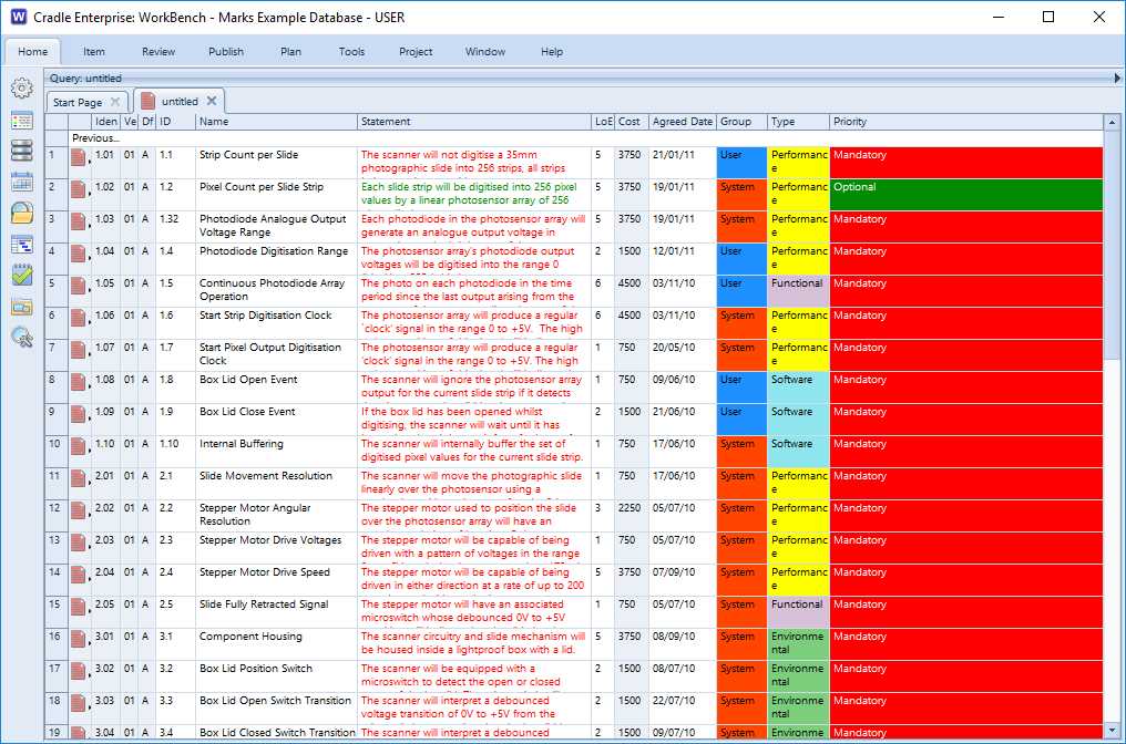
Using the smaller text, the above query and view will be shown like this:
Uses
Cradle provides several options to maximise the screen area used to display information. You can change a user preference to change the size of text used throughout the UI.
You can use these in combination to:
- Simply see bigger text and reduce the risk of eye strain
- Reduce the risk of eye strain and also maximise the display area so you do not reduce the amount of information shown in the UI
- Use smaller text because you are using a low display resolution and Cradle is using text that is needlessly large for your display
- Reduce the size of text and also maximise the display area because you have a large screen and good eyesight and you must have the maximum possible data visible, particularly when you are using multiple panes to display multiple sets of information at the same time

