From Now to Goal – Requirements Management

Goal

If you don’t know where you are currently, or how you arrived or what your ultimate goal is, how do you know in which direction to head? Requirements Management is a skill made easier by the full traceability of tools such as Cradle.

non directional ruler
From – Now – Goal

Build Me a Home

Starting a project without having a base understanding of the situation is a like building a house on unstable foundations. When the walls start to wander you’ll have no idea whether it was because the foundations were not level or were inappropriate or whether the direction of the wall is simply wrong.

Not knowing the ultimate goal could lead to a double height wall being built for a bungalow.

If you have no measure of how high the wall currently stands, you’ll have no chance of estimating how long it will take to finish.

Baseline, Elicit  and Measure

It may sound obvious when applied to the ‘simple’ task of  building a home. It appears ridiculous to start building without knowing whether our goal is a bungalow, house or flat. Yet many projects start with a very loose understanding  between stakeholders and producers and can head off in the wrong direction.

Baseline

Do we know the current situation? Do the foundations exist, is this a single storey  build that needs extending with an upper floor or are we to start from scratch. Are there any assumptions we need to record, this project assumes that there bedrock will be found within a metre.

Elicit Requirements

Have we investigated what the customer / stakeholder actually wants? We could achieve the same m2 with two storeys or one larger floor. No point building a house and then finding mobility restrictions mean a bungalow was needed. Do they actually need a house. The baseline may show they actually have somewhere to live and all they need is some more storage. We could provide them with a shed and achieve their goal. This honesty in not selling them a new house may mean we have a smaller turnover, but a far better reputation. This should lead to repeat and new business as knowledgeable supplier.

Measure

This needs to be done at each stage. Internally we need to know that we are meeting the design. When do we stop building the walls? Externally we need to know that the customer is going to be happy. Milestones and intermediate reviews will prevent big surprises at the end. Whilst we want to avoid requirements creep, we have no intention to build a mansion for the price of a flat, customer requirements change and to remain agile, we need to build in steps to accommodate change.

Summary

If you can see the sense in this simplistic example you have every justification you need to correctly control and manage your project. If you can’t see the point, you’re likely to return to your back of envelope calculations and assumptions of what your customer needs. Good luck to you, but we’d prefer you to take steps to de-risk your plans. Put yourself on the receiving end, a 20 storey building each with a floor of 1m*1m and a ladder pinned to the outside. It fulfils the requirements, but you try sleeping in your new bedsit.

Making Space – Maximized Data Display Area

I Need More Space

There is a lot of information in the WorkBench UI (User Interface). Sometimes you want a concentrate on one aspect, and it many not be possible to see everything you want in one go. You may be using Cradle on a laptop or tablet with a small screen and a limited display resolution. If so, you may want a maximised data display area, by reducing the screen area occupied by the Cradle UI controls. Make space in Cradle’s WorkBench interface by closing sidebars and the ribbon, status bar and Quick Access Bar (QAB).

Maximised Data Display Area

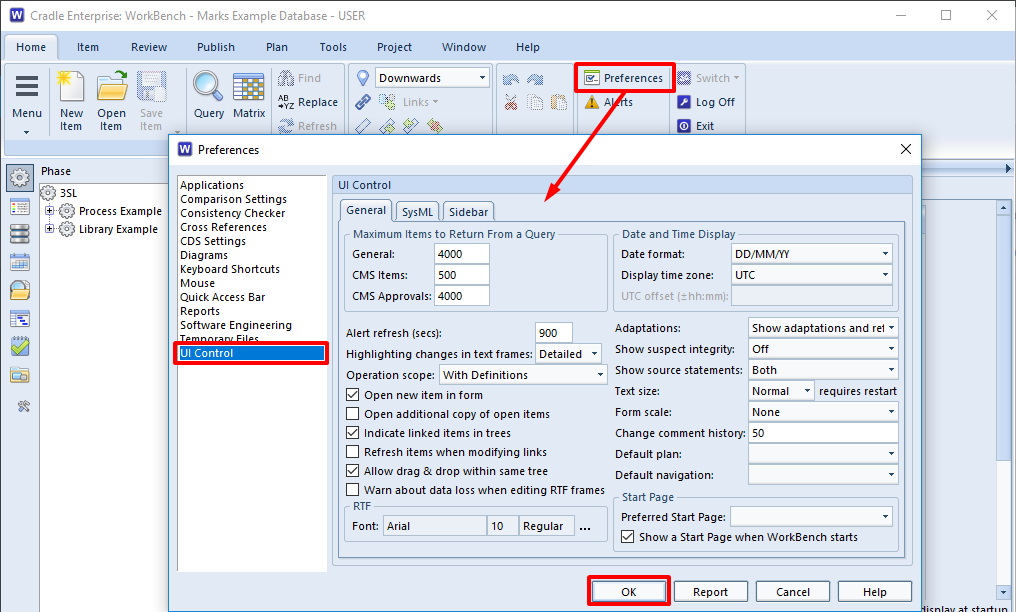
You can do several things to maximise what you can see in the WorkBench UI. In general, these are all to minimise or hide parts of the WorkBench UI. You can make many of these changes permanent by setting your preferences. To set yourpreferences, select Preferences in the Home tab, make the changes (typically in the UI Control group) and finally, click OK.

set UI preferences in 3SL Cradle RM SE Tool
Setting UI Preferences

Hide the Sidebar

You can hide the sidebar on the left of the UI by clicking whichever sidebar’s button is currently selected. This will make the sidebar disappear.

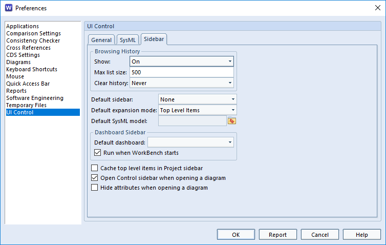
You can prevent a sidebar being shown when WorkBench starts by setting the Default sidebar user preference to None:

maximised data display area in 3SL Cradle RM SE Tool
Set No Sidebar

Hide the Quick Access Bar

The Quick Access Bar is a horizontal menu of buttons that provides easy access to sets of queries that Cradle creates automatically when you define item types in your database schema.

You can hide the quick access bar from the Window group in the ribbon:

maximised data display area in 3SL Cradle RM SE Tool
Hide the Quick Access Bar

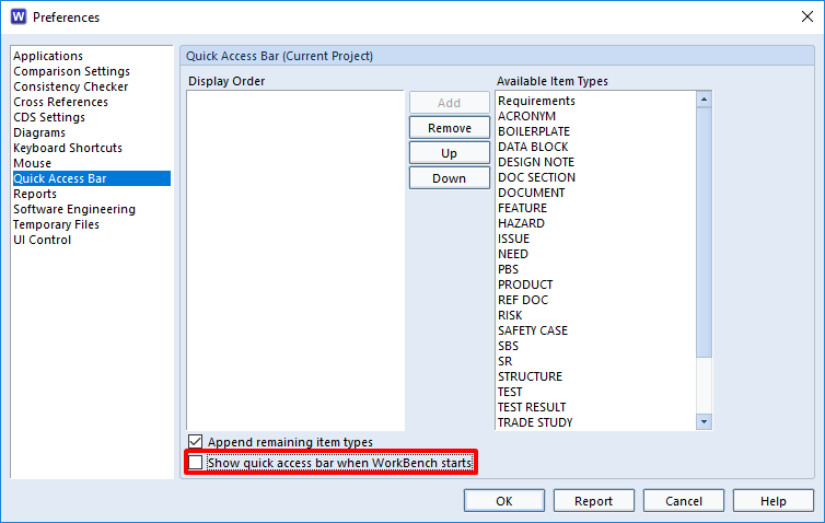
You can prevent the quick access bar being shown when WorkBench starts by de-selecting the preference Show quick access bar when WorkBench starts:

maximised data display area in 3SL Cradle RM SE Tool
Set No Quick Access Bar

Hide the Status Bar

The Status Bar is a horizontal collection of status indicators shown across the bottom of the UI. You can hide the status bar from the Window group in the ribbon:

maximised data display area in 3SL Cradle RM SE Tool
Hide the Status Bar

Minimise the Ribbon

You can minimise the ribbon across the top of the UI by double-clicking to the right of the tabs, typically to the right of the Help tab.

Maximise Diagram Area

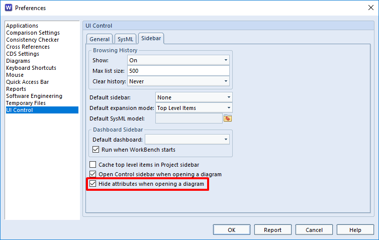
When you edit or view a diagram in any model, Cradle will display it in a form. This form includes the diagram’s symbols in a drawing area. It also includes other diagram attributes. You can set the preference so that you only see the diagram’s symbols when a diagram is first drawn:

maximised data display area in 3SL Cradle RM SE Tool
Hide Diagram Attributes

Press A to toggle the display of the other diagram attributes.

Normal Display Area

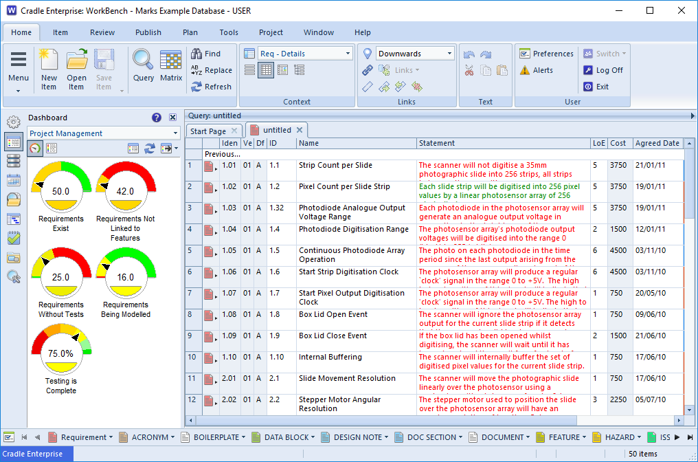
For illustration, a typical WorkBench UI showing a query with a simple view in Table style would appear like this:

maximised data display area in 3SL Cradle RM SE Tool
Normal Data Display Area

Maximium Display Area

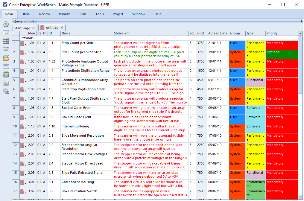
If you use all of the tips described here, the UI will have a maximised data display area and will appear like this:

maximised data display area in 3SL Cradle RM SE Tool
Maximised Data Display Area

This is a useful increase in the screen area used to display information.


Article Updated: More details 26/07/2018

Manual ‘ V’ Cradle

Compare

When it comes to managing your requirements  and designs there really is no contest between a manual based system and a tool based system.  A cross referenced and baselined design in Cradle is your ultimate goal.

Manual

A manual based system at worst is a set of paper requirements, managed in folders with paper-clips and sticky notes. An electronic system may include a number of word processor documents, drawings and spreadsheets. These have very limited, or manually updated meta data to describe how they interlink.

RM tool

A Requirements Management and Systems Engineering software tool brings these elements together in one place and provides the meta data and traceability that binds them together into a successful project.


Paper and pencil versus Cradle
Manual versus Cradle